Marketing Notebook
Ad teardowns and original concepts from my digital marketing training, and what each exercise taught me about planning content.
Independent learning exercises completed during digital marketing training. This is not client work: no brand commissioned, reviewed or approved any of it. Brand names and marks belong to their owners.
How an ad gets taken apart
Every teardown used the same checklist, so different brands could be compared like for like.
Caption
What the line promises, and to whom.
Visibility
Where the caption and logo sit, and what is read first.
Colour
Brand-colour consistency and the pop colour.
Visual elements & symbolism
What each object stands for.
Psychology
The emotion or bias being triggered.
Objective
What the ad is meant to change (awareness, sales, trial).
Creative idea / plot
The story in one line.
Insight
The human truth behind the idea.
CTA
Hard, soft or absent, and why.
Four ads, one framework
Observations are my own readings of publicly available ads, not statements from the brands.
What Stood Out
- Objective: brand awareness.
- A mother camel stops her calf drinking from a dirty, open tank and finds a Bisleri bottle instead; the ad ends on “Piyo Bisleri”.
- Teal brand colour for recall; “Celebrating 50 Years of Trust” adds legacy; desert and camels signal water scarcity; the highlighted ₹10 PET bottle signals affordability.
- No direct CTA, but the ₹10 bottle works as a soft push to try.
“Emotion can carry a trust claim better than a feature can. Comparing the brand to a mother’s instinct makes safety feel obvious instead of argued.”
From analysis to ideas
Three concepts written after the teardowns, each starting from an objective.
“Why So Serious? Piyo Bisleri.”
Position Bisleri as a quick refreshment break that relieves stress and keeps you going through the day.
Six-Step Narrative Storyboard
Sequential CutsCamera drifts behind a man working intensely on a laptop; a Bisleri bottle sits in the foreground on the desk.
Close-up of a tense, overwhelmed face; a dry gulp signals thirst.
Focus shifts to the bottle; water sparkles as he lifts it; soft crackle and water sound design.
Slow, satisfying sips and a small exhale of relief.
Bottle back on the table, he smiles and starts typing with new energy.
The background softly blurs and the line appears: “Why take it seriously, Piyo Bisleri!”
“Piyo Bisleri. Stay Refreshed.”
Clean minimal office, brand colours kept subtle, soft cinematic lighting, crisp focus on bottle clarity and water sparkle.
“Every Situation Needs the Same Choice.”
Awareness, reinforce Bisleri as the default choice for pure, safe hydration, and lift recall with urban youth and a general audience (situational marketing).
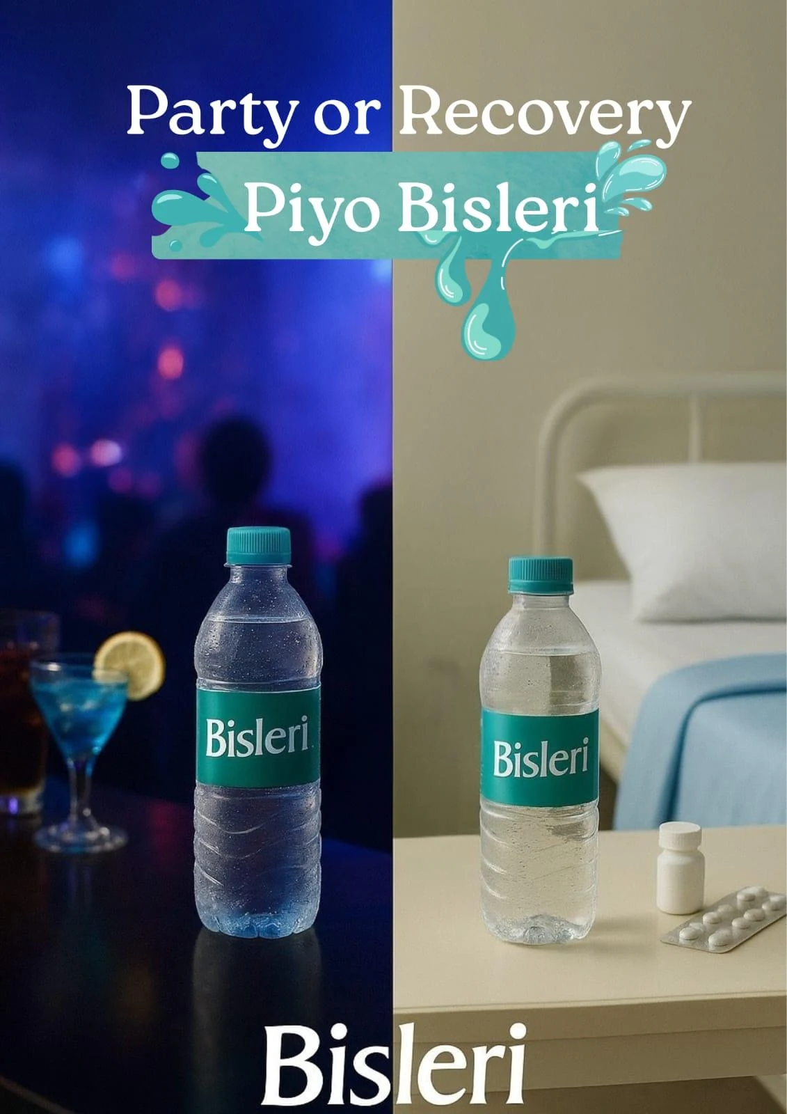
Concept mock-up. Not an official Bisleri creative.
A dual-environment poster showing that hydration stays constant whatever the situation. Left: club scene, dim neon, blues and purples, energetic. Right: hospital scene, soft whites and medical blues, calm. The Bisleri green connects both halves.
“Party or Recovery, Piyo Bisleri.”
Alternate line: “Different moments. Same hydration.”
Shows versatility; trust across situations; a strong lifestyle contrast gives recall; the dual-tone layout grabs attention.
“Expectation vs Reality”
A personal concept for a digital marketing institute, riding a live Kolkata moment.
Second-by-Second Video Flow
Shaky, fast-cut crowd footage with a loud viral sound.
Continuation with a second crowd clip.
Quick black screen or blink transition to someone looking confident and relaxed over a chill, confident beat.
KDMI mention with the CTA prompt.
Segment reserved for detailed course takeaways and campus proof points.
Segment to be developedJoining info and contact details with the brand logo.
What these exercises taught me
Start from the objective, then the idea. Each teardown began with what the ad was meant to change, which made every creative choice easier to judge.
Awareness ads can still carry a soft CTA. A visible price or a product close-up does the job without breaking the story.
Emotion before logic. The strongest ads in the set sold trust through a feeling, a mother's instinct or a smart choice, rather than a claim.
Colour and placement are strategy. Consistent brand colour and logo position are what make an ad recognisable in a second.
Timing is a creative tool. Pairing an offer with a live local moment, a festival or a city event, gives content a reason to be watched now.
“The same checklist-driven habit carries into my content planning work.”
Source documents
Original raw exercise notes, teardown matrices and concept drafts prepared during training.